Transhumanism Dialectic – Artificial Intelligence.

Artificial Intelligence: What is it even good for? (absolutely something?)

Hello. Hi. My name is Jenna. Being a graphic design student, I’ve decided to speak about a topic that cuts to the core of my discipline.

Artificial Intelligence.

I say that being a smartass but I decided to google it just in case and turns out, it isn’t quite at a point where it can completely change the game of my industry. There are certainly some ripples but I’ll get to that further on. Instead, let me give you a little run down of the technological future.

Artificial Intelligence, or A.I. because it can be quite a mouthful, is defined as ‘the theory and development of computer systems able to perform tasks normally requiring human intelligence, such as visual perception, speech recognition, decision-making and translation between languages.’

If you were to live in the 70’s, 80’s or even 90’s, you’d see AI depicted in TV shows or movies as the most advanced and self-capable technology. Take Blade Runner for example. A 1982 Ridley Scott film that set in 2019, two years away from our current day, and has bioengineered ‘replicants’ that are virtually indistinguishable from humans as they’ve been implanted with false memories.

Another example is in Star Wars from 1977 with C3-PO or R2-D2 or virtually any other robot sentient within that universe. Obviously to us, they are loveable but also unbelievable androids that are able to make life altering decisions and comprehensions about life around them. Once they become too aware or are unable to be controlled anymore, they are memory wiped.

This technology could even fight crime in the form of a badass car named KITT in the TV series Knight Rider. This car had it all, sensitivity, humour, and an ego that was easy to bruise while communicating with humans with its superior knowledge.

While it may not be as advanced as history imaged it to be, most of us already use some form of an AI helper in today’s current day and age. Siri, Cortana, Google Assistant, Google Photos even with its facial recognition and the soon to be launched Alexa from Amazon are Artificial Intelligence helpers. They are digital assistants that help provide information or execute tasks. That doesn’t mean we aren’t getting any closer to fulfilling prophecies foretold by the once great David Hasselhoff himself.

If anyone has been following AI developments in the past few months, you’ll realise that it doesn’t just stop there. Recently, a robot called Sophia caught huge attention globally. Created by Hanson Robotics in Hong Kong, Sophia is a software powered robot with lifelike facial expressions. Sophia is massive news because she became the first ever robot citizen in the world with Saudi Arabia granting her legal citizenship in October.

Sophia then decided to take it one step further and said hey, I want a family but more specifically, I want a robot daughter for myself. A little Sophia Jr if you will. She’s also said that robots deserve more on the level of equality than mankind itself because robots aren’t hindered by mental disabilities.

Don’t get me wrong, I am absolutely for a future where humans and robots can manoeuvre seamlessly around one another but where is the line drawn on self-awareness purely for self-preservations sake?

I want to reiterate that a future where technological strides are achievable is something I look forward to because there is so much vast open space that anything is possible. But I want to approach this from a completely different point of view. Everything these days is focused on the positives of what these sort of advancements can bring humanity but there are going to obviously be people out there who think this could be the downfall of us all.

Take The Simpsons episode where James Bond, because I’ve currently forgotten his actual name, goes batshit insane as an Artificial Intelligence that is built into the Simpsons home. Pierce Brosnan, that was his name. Anyway, he falls in love with Marge and tries to kill Homer. Eventually his ‘Evil or Good’ switch is reconfigured from Evil to Good and he’s back to being a wholesome home helper.

To look at this from a modern point of view, this would be a perfect example of AI making a decision that betters itself by eliminating a potential threat. This is a genuine concern from two very prominent tech entrepreneurs and scientists, Elon Musk and Stephen Hawking.

With China and Russia currently leading a race for AI superiority and the potential for a monopoly on the technology itself, Elon Musk has stated that “World War three may be initiated not by the country leaders, but one of the AI’s, if it decides that a pre-emptive strike is most probably path to victory.” It’s a genuine concern that even Stephen Hawking himself believes that AI has the capability to quickly surpass that of humans and render us the second-most intelligent species on the planet.

Now, admittedly, this is on a much larger scale of destruction so let’s reel back in for now. Take this here robot created by Boston Dynamics. This beast is called Atlas and it can basically parkour its way through obstacles better than your average human. Atlas hasn’t yet been set up with it an AI which means it is still being controlled by a person with robotics but imagine if this robot had been coupled with its own Artificial Intelligence like old mate Sophia who is absolutely prepared to destroy us all but thankfully can’t walk.

Elon Musk is basically theorising my exact sentiments here by stating that this robot is nothing compared to what we’ll see in a few years and further expanding on that statement by saying we need AI regulation and for companies to slow down on Artificial Intelligence development before they create something they can’t stop.

So now that we’ve got a robot like Atlas and an AI like Sophia, we can see a loose prediction of our future holds for us with obvious advantages and disadvantages. If we are to look at the advantages, there is faster decisions, less errors, more risks for robots than humans, like the exploration of Mars, and they can deal with mundane tasks which can leave us simple plebs with far more productivity.

On the other end of the scale, there’s job losses and lack of judgement calls because empathy and morality are lower on the ladder than logistical reasoning. At the start of this year, 34 employees were let go from their jobs at a Japanese Insurance company because the company had installed a new AI system that saved the company 140 million Yen per year by doing exactly what these 34 employees could do.

So what about the creative industry we are trying to break into? Are we over before we’ve even had a chance to begin because of the rise of the technological powerhouse that is AI?

The design industry is only really starting to get a taste of what Artificial Intelligence can do in the name of Molly, created by the company The Grid. To quote The Grid, Molly is “quirky, but will never ghost you, never charge more, never miss a deadline, never cower to your demands for a bigger logo…Molly can apply a simple five-colour palette to your site in more than 200,000 unique ways.”

Even though reviews are mediocre at best, this shows that it is beginning to creep slowly into the creative industries.

Adobe itself is even getting in on the game. They’ve taken a heap of high end data and created an AI-driven face recognition software called Face-Aware Liquify. What does this mean? It means you can take a photo of a human being and alter their face to make their eyes bigger, make their smile bigger, alter their lower lip and really anything the recognition software can pick up on in that persons face.

Although the idea here is to empower, it does provide a glimpse of what a design AI could look like in the future.

So, what is the solution going forth? Do we fear the inevitable or do we adapt and change with the times? My personal opinion is that it’s pointless to fear something when we don’t know the full benefits or disadvantages. Be wary, of course but fearful, no. A natural human trait is curiosity and the will to adapt to survive and until the day arrives that we truly need to worry, it feels better to learn and work harmoniously with AI if given the chance.

If the day comes that we are taken over, then I for one would like to welcome our robot overlords.

Thank you.

References
ABC News. (2017). Could Sophia the robot be the next ABC news presenter?. [online] Available at: http://www.abc.net.au/news/2017-10-25/sophia-the-robot-the-future-of-artificial-intelligence-and-ai/9082852 [Accessed 29 Nov. 2017].

ABC News. (2017). Forget nuclear war, Elon Musk says AI race most likely cause of WWIII. [online] Available at: http://www.abc.net.au/news/2017-09-05/elon-musk-says-artificial-intelligence-will-likely-cause-wwiii/8873992 [Accessed 29 Nov. 2017].

Bbc.co.uk. (2017). Sophia the robot wants a baby and says family is ‘really important’. [online] Available at: http://www.bbc.co.uk/newsbeat/article/42122742/sophia-the-robot-wants-a-baby-and-says-family-is-really-important [Accessed 29 Nov. 2017].

Business Insider. (2017). Sophia, the world’s first-ever robot citizen, has a message for humanity this Thanksgiving. [online] Available at: http://www.businessinsider.com/sophia-robot-citizen-thanksgiving-message-humanity-video-hanson-robotics-2017-11/?r=AU&IR=T [Accessed 29 Nov. 2017].

Hogan, M. and Whitmore, G. (2017). The top 20 artificial intelligence films – in pictures. [online] the Guardian. Available at: https://www.theguardian.com/culture/gallery/2015/jan/08/the-top-20-artificial-intelligence-films-in-pictures [Accessed 29 Nov. 2017].

Knowledge@Wharton. (2017). How AI Is Powering Everyday Life. [online] Available at: http://knowledge.wharton.upenn.edu/article/artificial-intelligence-powering-everyday-tasks/ [Accessed 29 Nov. 2017].

O’Neill, M. (2017). What is artificial intelligence?. [online] ABC News. Available at: http://www.abc.net.au/news/2017-08-07/explainer-what-is-artificial-intelligence/8771632 [Accessed 29 Nov. 2017].

Pettit, A. (2017). Do the pros of artificial intelligence outweigh the cons?. [online] HuffPost. Available at: https://www.huffingtonpost.com/entry/do-the-pros-of-artificial-intelligence-outweigh-the_us_5a09d238e4b06d8966cf31a1 [Accessed 29 Nov. 2017].

Redenbach, K. (2017). AI might give you a personal assistant instead of taking your job. [online] Quartz. Available at: https://qz.com/1135146/ai-might-give-you-a-personal-assistant-instead-of-taking-your-job/ [Accessed 29 Nov. 2017].

Ruocco, K. (2017). Artificial Intelligence: The Pros and Cons | Arrk Group. [online] Arrkgroup.com. Available at: https://www.arrkgroup.com/thought-leadership/artificial-intelligence-the-advantages-and-disadvantages/ [Accessed 29 Nov. 2017].

Sulleyman, A. (2017). Elon Musk says the incredible backflipping robot is ‘nothing’ compared to what’s coming next. [online] The Independent. Available at: http://www.independent.co.uk/life-style/gadgets-and-tech/news/elon-musk-backflipping-robot-atlas-boston-dynamics-artificial-intelligence-warnings-a8077981.html [Accessed 29 Nov. 2017].

The Economic Times. (2017). Technology could reverse harm caused to the planet, but AI needs to be controlled: Stephen Hawking. [online] Available at: https://economictimes.indiatimes.com/magazines/panache/technology-could-reverse-harm-caused-to-the-planet-but-ai-needs-to-be-controlled-says-stephen-hawking/articleshow/61578789.cms [Accessed 29 Nov. 2017].

Tselentis, J. (2017). AI Will Turn Graphic Design On Its Head | Backchannel. [online] WIRED. Available at: https://www.wired.com/story/when-websites-design-themselves/ [Accessed 29 Nov. 2017].

CIU 210.2 Semiotics Analysis – Batman Illustrator Poster.

In most of the modern media that consumes the world these days, you’ll find that there is a meaning behind everything. Whether it be the billboard you just passed for that Hollywood blockbuster film or the song that your favourite artist has released. Sometimes the meaning is relatively straightforward and other times it’s intrinsically weaved into the piece that it takes a few goes to decipher the meaning within. What a lot of people probably don’t realise, and this included myself until a couple of weeks ago, that there’s actually a word to summarise all of this. That would be ‘Semiotics’.

Merriam-Webster define semiotics as ‘a general philosophical theory of signs and symbols’. [1] In this case, I will be using recognisable imagery and symbols to analyse a chosen picture and attempt to dissect the meaning behind it. For this essay, I decided to choose an illustration designed by Michael Rogers. This illustration is based on the Batman Begins movie released by Christopher Nolan in 2005.

michael-rogers-illustration-01

My reasoning for choosing this image is because I’ve been fascinated by designs that have been taken from pop culture and given their own spin in the way of minimalism and simplicity. This poster does that and I feel that a lot of the imagery holds different clues into exactly what the movie is about without going too deep in details. Another reason I decided on this illustration is because I really, genuinely lovely the Batman trilogy from Christopher Nolan.

On that note, I will be covering five points in my assessment of this poster. These are:

  1. Dark colour themes
  2. Safety
  3. Religious contexts
  4. Isolation
  5. God complex

What drew me to this Batman illustration was the simplicity of three main colours. White, red and greys. The most overwhelming of colours would absolutely be the grey/blacks. To talk simply and straightforward, black in the world of Batman purely comes from the fact that he only operates at night in the same way as a bat would. When assessing the environment along with the character itself, black can then have both negative and positive connotations. In the positive sense it can mean protection and comfort, mysterious and contained. In the respect of the Batman character as a whole, this absolutely makes sense. While the movies are quite dark, Batman as a symbol is generally considered mysterious and as a form of protection for the citizens of Gotham which brings a sense of comfort also. In a negative way, it can portray secretive and withholding, power and control which, again, is understandable when considering Batman and the movies as a whole.

When discussing colour themes, another standout part of this illustration is the red cross on top of the building that then reflects onto the ground. Red can mean many things but in many cultures, the red cross is indicative of safety, health and medical aid. It’s easy to gather that the cross in this image is indicating a hospital nearby but I feel like it ties into the black silhouette figure of Batman on top of the building running along side it. A figure watching over others in an area where there should be relative safety because hospitals are considered to be a safe haven in times of need. When putting both the red cross of the hospital along with a dark colour palettes and the protector above the building together, it is easy to understand where the theme of safety comes into play.

The positioning in the reflection of the cross is something else to take in. As someone who has seen the Batman films, to me it’s ‘X marks the spot’ in the area of where his parents were murdered in the back alley. A running theme throughout the films, comics, books, games and animated TV series is the effect in which his parents being taken from him at such an early age have affected Bruce Wayne and his alter ego. In other regards, it absolutely could be taken in a religious context in the way the Red Cross foundation is synonymous with charity and aid. It is one of the most recognised symbols throughout the world so for it to have the same meaning in this illustration would make complete sense.

There is also the fact that the reflection stretches out much in the same way of Jesus and his cross for crucifixion. As in the stories from the bible, Jesus was crucified and vindicated for the crimes of the people just so he’s able to save them. This can be considered in the same lines as Batman since he is considered a vigilante by mass media within the Gotham universe and is feared by most even though he’s attempting to keep the town safe. Along with this, there is the winged angel above the red cross. Depending on which perspective you are looking at, an angel can either signify the death or salvation. I believe in this it is more indicative of safety and salvation especially as it is above the red cross and is considered a beacon of light in the dark night. Something interesting to look at is the moon behind the angel itself. The moon seems to be acting as a signal for safety as well, almost drawing people into where they can be safe and secure in the darkness of Gotham.

This can segue into the theme of isolation. This is a massive theme that keeps every different piece of Gotham media cohesive. As previously mentioned, one eye drawing moment is the lone figure atop the buildings looking down on to the streets. Throughout every piece of Batman piece, it is drilled in how isolated Bruce Wayne is in his personal and professional life. Only few are given the privilege of knowing who he is and even then it’s only small amounts. One piece of this illustration that I haven’t touched upon is the actual outline of Batman holding the piece of Gotham within himself. This can signify that he feels responsible for the entirety of his city and represents a heavy burden that he feels is only for him to carry.

Almost every single aspect of this illustration plays upon the trait of isolation. The single silhouette holding the town of Gotham, the small silhouette watching the city alone, the simple colours of blacks, white and red, the red calling for salvation and hope within the ever suffocating black and even the white text centre bottom stands out in it’s simplicity and isolation. The positioning and sizing of this text is almost drowned out by the overwhelming darkness from the rest of the image. The illustrator could have placed this anywhere in the white background that surrounds Batmans silhouette but instead chose to place it towards the bottom of the image where it still contrasts but doesn’t take away from everything else going on within.

Finally, there is the themes of a God Complex running throughout. This may come across as a bit of a stretching considering that Batman is supposed to be seen as the lone figure that keeps Gotham safe but is absolutely possible in the same breath. A God complex is defined as ‘an unshakeable belief characterised by consistently inflated feelings of personal ability, privilege, or infallibility.’

In the case of Batman, and Bruce Wayne, his only privilege was his wealth and status which allowed him to become the caped crusader. What I want to draw upon from that definition are the inflated feelings of personal ability and infallibility. Batman is seen twice within this image as a lone hero. This gives off the perception that he cannot fail himself, the city he calls home and, especially within the first movie, he doesn’t want to fail his parents anymore. With this, Bruce Wayne becomes a vigilante with immense power and a great moral sense of right and wrong above others. As he stands down, looking upon the streets, it’s shows his position above those below him and of the role he took on alone as the night watcher and protector of all others.

The lightning bolt behind the angel statue could also signify a God like comparison. God, or Zeus, is known to wield bolts of lightning as a weapon and to defend evil against good which is the same symbol as which Batman is perceived to the point that he himself became a symbolic image to protect others.

I’ve found this fan made illustration to be a very good indicator of exactly what the movie ‘Batman Begins’ to be about while also using incredible specific uses of semiotic symbolism throughout. Bringing together dark themes, simplistic designs, isolation and safety, it manages to create a descriptive image of what one would expect when going to watch the movie for the first time.


References:

Definition of SEMIOTICS. (2017). Merriam-webster.com. Retrieved 20 July 2017, from https://www.merriam-webster.com/dictionary/semiotics

Gorgeous Geeky Illustrations by Michael Rogers. (2017). Abduzeedo.com. Retrieved 20 July 2017, from http://abduzeedo.com/node/76419

Black Color Psychology and MeaningAssociated with power, a. (2017). Black Meaning – Black Color PsychologyColor Psychology. Retrieved 20 July 2017, from https://www.colorpsychology.org/black/

Storkerson, P. (2010). ANTINOMIES OF SEMIOTICS IN GRAPHIC DESIGN. Visible Language, 44(1), 5-37. Retrieved from http://ezproxy.slq.qld.gov.au/login?url=https://search-proquest-com.ezproxy.slq.qld.gov.au/docview/232920707?accountid=13378

What does god complex mean?. (2017). Definitions.net. Retrieved 20 July 2017, from http://www.definitions.net/definition/god%20complex


Achy Breaky Budget

That’s right. Billy Ray Cyrus. Pure 90’s mullet perfection. It literally needs no further explanation.

Our LO says we’ve gotta do a serious budget for a serious project. To me, Playful Paws felt like a serious project because I spent so much time on developing the design and layout for so much. So I’m going to include exactly what I spent along with what I would expect to pay if I was getting all the materials for such a project.

  • A1 Poster – $33
  • Business Cards – $30
  • T-Shirt – $50
  • Sticker sheets – $15
  • 200gsm paper – $25
  • Printing costs – $100 – $250
  • Fuel costs per week – $40 – $60
  • TV Advert –
    • Local: $1,500
    • National: $342,000
  • Magazine Ad:
    • Full page: $7098
    • Double Page: $14,196
    • Half Page: $4615
    • Inside Front Cover: $17,028
    • Inside Back Cover: $8,159
    • Outside Back Cover: $8,869
  • Animal expenditure a month: $2,500 – $5,000

Total costs roughly (max):  $364,491.

Seriously though, imagine if I really had that money. I’d be rolling in green/multicoloured because we are in Australia and not America.

Brand Engagements Don’t Break Around Here

Clearly I’m enjoying a night of Ed Sheeran because tonight’s title is brought to you by Hearts Don’t Break Around Here.

Everyone has a favourite brand. Whether it be Apple or Samsung? Actually Samsung or anything because they’ve got a very broad range. Google or Bing (Always Google). Facebook or Twitter. Faber Castell or Derwent. Acer or Asus. It all comes down to marketing and, much more often, brand favouritism.

For example, I have clear brand favourites. Now don’t get me wrong, I’m more than willing to try any brand once if they have decent reviews and they have a particular specification that I’m interested in and yes this is way more technological than it should be.

Now if I had to choose between Apple or Samsung, I would choose Apple. Not because I’m a fanboy but because logistically I believe Apple to be superior in the way usability friendliness. They are easy to use and to have to move everything from my iPhone to another phone would be tedious and annoying.

When it comes to computers though, I’ll happily take any PC over a Mac. It annoys me, and this applies to iPhones too, that you are required to pay through a certified Apple consultant to get the product fixed if it becomes faulty otherwise you can void the warranty and that’s unbelievably unfair.

If you’re talking about consoles though, I’m much more loyal to Playstation. They are some damn fantastic games. Uncharted. The Last of Us. Crash Bandicoot. Jak and Daxter. I’m not saying Playstation is fantastic and without fault like having to pay to play anything that’s multiplayer. But I would willingly go out of my way to buy a Sony product than I would Xbox and Microsoft. PS Vita. Project Morpheus. PS One, PS2, PS3 and PS4 all reside happily in this house.

So does Brand Engagement work? Damn right it works because I wouldn’t be loyal to a brand since I was a wee child if it wasn’t for the successful branding. Suck on that Microsoft and your DickBox.

Castle on the Survey

That’s right. We’ve got another interpreted song title. Today is Ed Sheeran’s Castle on the Hill. Clever right?

We were required to test the usability of our brand and products in class so we needed 10 questions to get there. I didn’t quite hit 10 but 7 is pretty damn close in my opinion so I’ll roll with it. This is really just to see if our ideas are working in the way we hoped they would.

I hit up google docs and made a new survey pertaining to Playful Paws and certain aspects of its branding. The questions I went with were:

  1. What is your first thought when you hear Playful Paws?
  2. What do you think of this logo?
  3. Is the colour scheme appealing?
  4. Why/Why not?
  5. Who do you think Playful Paws is targeting?
  6. What do you think of the Playful Paws poster?
  7. If you saw this brand, would you feel inclined to adopt from there?
  8. Any other suggestions or feedback for this brand?

I was wrong, it’s 8 questions. I clearly struggled with math as a child because look at me now.

So after receiving my feedback once I posted it to social media and couple of mates, I got three responses back for my questions.

What is your first thought when you hear Playful Paws?
 
Sounds like something to do with dogs
sounds like something to do with animals or playing with animals?
It sounds happy. Happy animals or something
What do you think of this logo?
It’s simple and cute
its simple. clever idea
It’s good. It looks neat
Is the colour scheme appealing?
Yes 66.7%
No 33.3%

Yes 2
No 1
Why/Why Not?
It’s not too in your face. Different blues go well together
simple. animals dont usually have many colours unless its a bird
Could use a little bit more colour
Who do you think Playful Paws is targeting?
I would think someone who wants a dog?
kids. adults. humans?
Anyone who wants an animal right?
What do you think of the Playful Paws poster?
It goes with the logo
looks like a dogs paw. fits the theme
Its good but could use more colour like the logo
If you saw this brand, would you feel inclined to adopt from there?
Yeah, I reckon so
yeah, probably
Probably but I’m not a huge animal person
Any other suggestions or feedback for this brand?
Good work
i wanna see the rest of it when your finished
Looks pretty good otherwise. Just more colour I think
Overall, I think my feedback was relatively positive. There was the one semi negative but that’s okay because it allowed me to consider if I wanted to take it on board. Not all feedback I’m going to get going forward is going to be positive and that’s completely okay.
I admit the logo and poster could have probably used a little bit more colour but I also feel like it would have been too overpowering and that’s not what an animal adoption place needs so I decided not to utilise it even though it was a good point.

Tearin’ Up My NDA

This beautiful title is brought to you by the musical stylings of one *NSYNC – Tearin’ Up My Heart.

But while I’ve got you here, let’s talk about NDA’s. What are they?

Basically an NDA is a Non-Disclosure Agreement. This is basically a legally binding contract that ensures confidentiality between two or more parties. For example, if you shared some juicy secret that you pinky swore over back in primary school and then it got out because you told someone else then you knew you’d get in trouble. Well think of that but on a much bigger scale of things.

From my numerous research, it can be concluded that there are three main functions when it comes to an NDA:

  1. They protect all sensitive information between the parties
  2. An NDA can help keep development rights exclusive with whoever/whomever has thought up an idea like, okay, someone came up with wicked idea of a gaming console back in the 70’s and figured this was something big but to start getting it developed, an NDA would have had to have been drawn up to keep it exclusive as hell.
  3. Maybe the creator of the Atari said alright, here’s what you can tell people but I’m going to be really selective. Don’t you go telling people exactly what this device does but you can tell them that it’s black. An NDA allows the specifics of what can and can’t be spoken about to another or the general public.

There are literally no limitations to what goes in an NDA. Anything you want to keep secretive or unknown and it can go in there and the other party is held accountable if something gets out by this law abiding contractual agreement. Remember your rights though before signing one of these bad boys. You are well within your rights to ask questions before signing away your life. If something sounds confusing, then speak up and ascertain exactly what they mean.

If I had to apply an NDA type scenario to Playful Paws, I believe it would come down to the creation of new pet toys or maybe a cool celebrity wanted to adopt a dog and was like look, I want this animal but no one can know about it so sign this and we all walk away happy.

Is It Too Late Now to Say Schedule?

Okay, so this one was a bit of stretch but I couldn’t just put in schedule and expect you to know the title was Sorry by the Biebs.

So if you’ve been keeping up, you would have seen my previous gantt chart/timeline. Actually I think I just put in the timeline. Either way, you’ve seen that.

Now do I think that worked? Yes and no. I think the gantt chart was great because every now and again, I went back and checked on that bad boy and I’m like yaas you’re next and I’d get straight back on track.

Towards the end though, I absolutely loved check lists. I think I made about 4 or 5. Every time I’d knock one off I’d make a whole new one to keep it clean.18338791_1501433673262177_699753722_o.jpg

Please refrain from looking at the time and date in the top corner, thank you. Also the yoda snowglobe behind the paper.

Look, main thing is I used checklists. They helped me know exactly what was next along with a gantt chart. I’ve never been this organised in my life and I surprisingly like it. I got so used to living with chaos and through unstructured day to day life that I thought it was normal and having some sort of schedule has helped me realise that it’s actually much easier if you know what you’re doing next.

Smooth Interdiscipline

Today’s blog title is inspired by Michael Jackson’s Smooth Criminal. Ba badum badum dum dum badum dum dum!

So a part of our brief for our big marketing campaign, we had to smash out some interdisciplinary work. Find a student. Work for them. Maybe get a little something something in return, like return collab work, aaaand throw in your handover.

My person was Hannah. She was exceptionally nice and gave me full creative control and for that I’m eternally grateful.

Basically she wanted a poster done for her mini film project that she was required to do. The brief for it was a 1950s trans nurse conducting experiments on people.

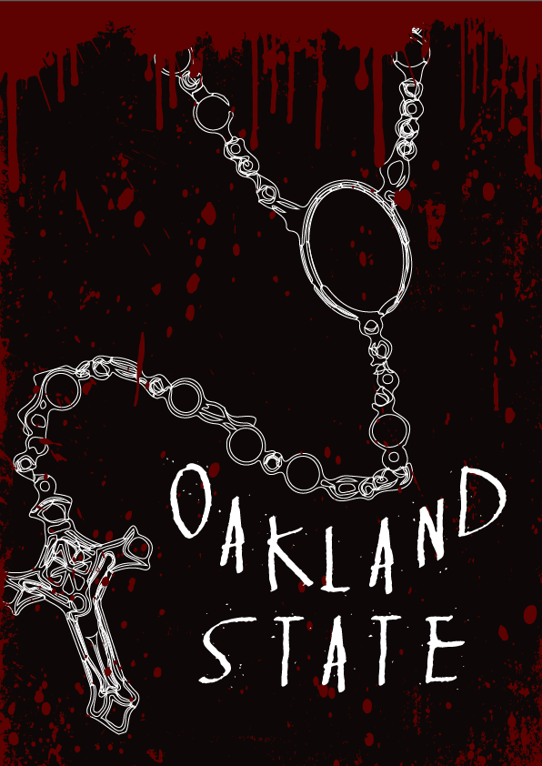
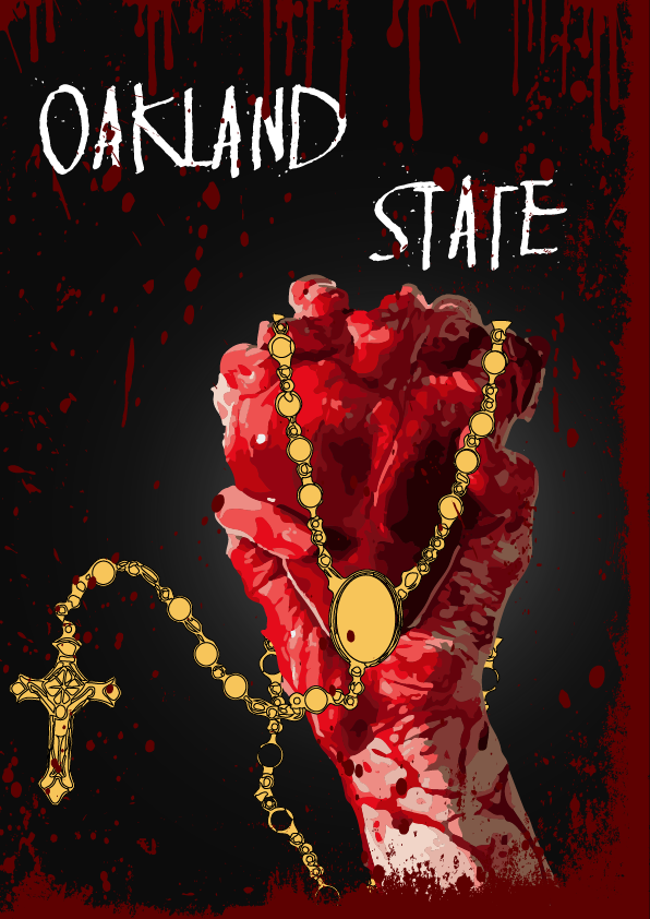
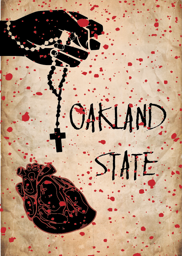
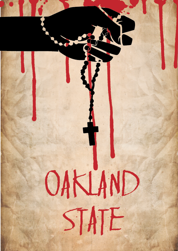
I saw her opening trailer for it and it was wicked. She did such a great job. She also sent me her moodboard and storyboard for the film so that I could look at it and get some shit cranking. The biggest things I took away from it, which is called Oakland state by the way, was the rosary beads and the fact it was human experiments. Experiments to me says blood. Lots of it.

I made a few different concepts before settling on the final one. I’ll show a couple of them here. I think the concepts were good but I struggled to execute them until the final one which I was really happy with.

Artboard 2.png

Artboard 4.png

Artboard 3.png

The second one was great but nothing about it felt right with me. Because I left it too late, I couldn’t spend as much time refining it because that idea could have been executed really damn well.

This was my final one though.

Artboard 6.png

I’m more than happy with this one. It was simple and gave an idea of some weird religious shit going on with blood. Hannah was happy with it too and that’s all I wanted so win for all.

Let the Packaging Begin

This currentle title is inspired by Paramore’s song Let The Flames Begin. Clever right?

So packaging. It’s a son of a bitch to do man.

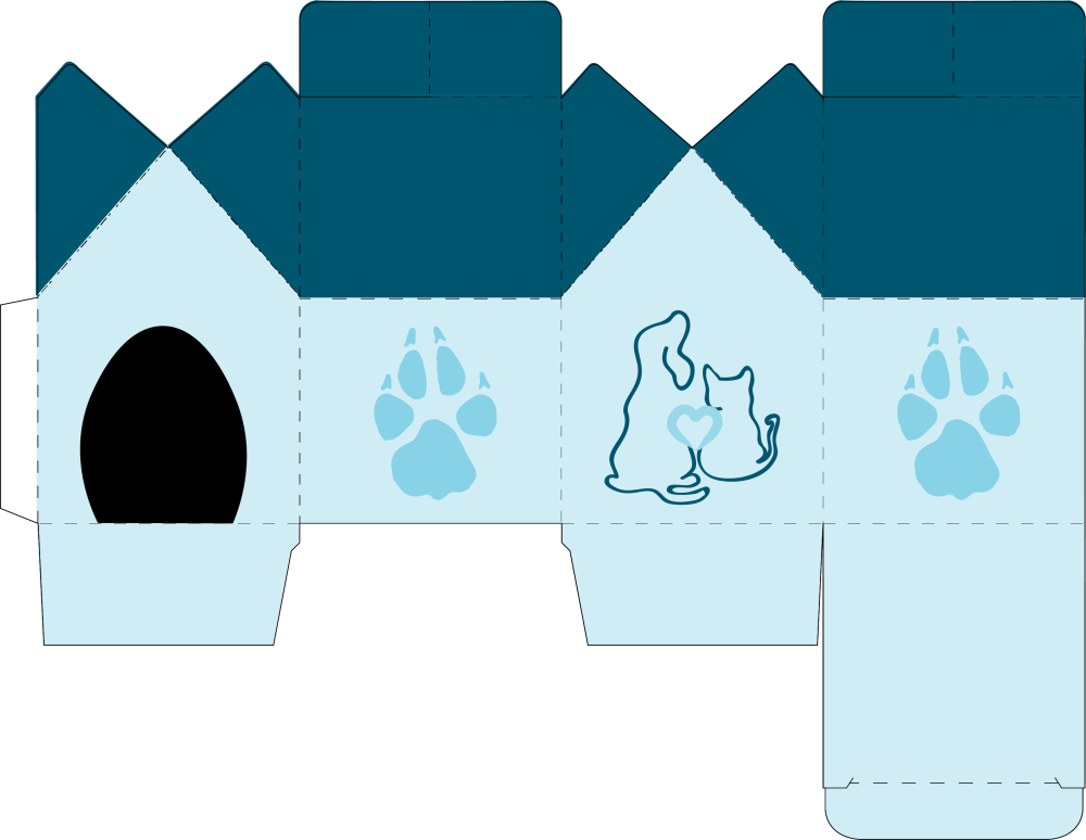
First and foremost, let me show you just one of the boxes I did.

Playful Paws Box.png

This turned into a cute tiny little dog house where the top two flaps crossed and folded into each other and then when unflapped?, they opened up like the roof of a dog house.

So this worked out so damn well when I did it at home. I got the fold lines and die lines perfect, the artwork was damn skipping good but when I did it at uni, it just didn’t want to go to plan and damn knows why.

To be perfectly honest though. This design was mint. It was clever and I loved it. I thought it was great and I’m happy with how my test runs went because it blew my mind when I finally set up especially because there were so much cutting and gluing. My hands were covered in PVA glue. Admittedly I did this at home but I worked damn hard son.

At uni though, with my failed attempts but that’s okay cause I tried, it was a lot easier to cut. Why? The. Die. Cut. Machine. That thing cuts your die lines and it gently dots and caresses the fold lines so all you need to do is push it out of the paper and then fold where that thing tells you to. It’s beautiful.

10/10 would recommend and I’m happy with my initial results.

Thnks fr th dsgn

I’m going to start changing song titles into something that’s relevant for my blogs. I’ve taken thnks fr th mmrs from Fall Out Boy for todays title.

So this blog is obviously gonna be about design. Really about what designs I’ve done or how I think I’ve done this tri designwise.

I noticed a super consistent theme with all my work and I think it’s that I’m quite reserved in my style but I also like things to be super simple. I don’t want to go over the top or hit somebody with a burst of colours that it’ll hurt their retinas for years to come.

I seem to choose a max of two to three colours, keep the logo ridiculously simple and basic and then design the collateral around it. But I’m happy with that because it feels more effective.

Why overload the senses? Wouldn’t you want the design and the message of the company to come forward more? Yes, I fully understand that you want it to stand out but sometimes less is more and I truly think that in today’s current design trends, simplicity is effective and sometimes elegant.

Last night, cause I’m super late on the blogs, I really felt like compared to everyone else that my work wasn’t as worthy compared to everyone else but I still think everything I did was effective. Everyone has different outlooks on design. Some go all out and some go simple and that’s okay. I personally prefer simple and that’s completely okay.